- Overview
- Documents
6 Chart types
Visualise your data in different ways. Each of them animated, fully customisable and look great, even on retina displays.
HTML5 Based
Chart.js uses the HTML5 canvas element. It supports all modern browsers, and polyfills provide support for IE7/8.
Simple and flexible
Chart.js is dependency free, lightweight (4.5k when minified and gzipped) and offers loads of customisation options.
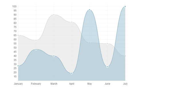
Line charts
Line graphs are probably the most widely used graph for showing trends.
Chart.js has a ton of customisation features for line graphs, along with support for multiple datasets to be plotted on one chart.
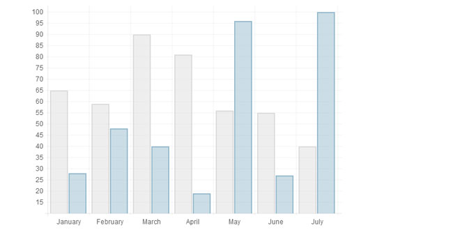
Bar charts
Bar graphs are also great at showing trend data.
Chart.js supports bar charts with a load of custom styles and the ability to show multiple bars for each x value.
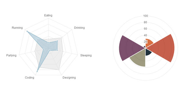
Radar charts
Radar charts are good for comparing a selection of different pieces of data.
Chart.js supports multiple data sets plotted on the same radar chart. It also supports all of the customisation and animation options you'd expect.
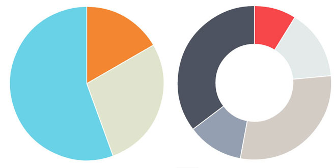
Pie charts
Pie charts are great at comparing proportions within a single data set.
Chart.js shows animated pie charts with customisable colours, strokes, animation easing and effects.
Polar area charts
Polar area charts are similar to pie charts, but the variable isn't the circumference of the segment, but the radius of it.
Chart.js delivers animated polar area charts with custom coloured segments, along with customisable scales and animation.
Doughnut charts
Similar to pie charts, doughnut charts are great for showing proportional data.
Chart.js offers the same customisation options as for pie charts, but with a custom sized inner cutout to turn your pies into doughnuts.
Getting started
Include Chart.js
First we need to include the Chart.js library on the page. The library occupies a global variable of Chart.
Creating a chart
To create a chart, we need to instantiate the Chart class. To do this, we need to pass in the 2d context of where we want to draw the chart. Here's an example.
We can also get the context of our canvas with jQuery. To do this, we need to get the DOM node out of the jQuery collection, and call thegetContext("2d") method on that.
After we've instantiated the Chart class on the canvas we want to draw on, Chart.js will handle the scaling for retina displays.
With the Chart class set up, we can go on to create one of the charts Chart.js has available. In the example below, we would be drawing a Polar area chart.
We call a method of the name of the chart we want to create. We pass in the data for that chart type, and the options for that chart as parameters. Chart.js will merge the options you pass in with the default options for that chart type.
Introduction
A line chart is a way of plotting data points on a line.
Often, it is used to show trend data, and the comparison of two data sets.
Example usage
Data structure
The line chart requires an array of labels for each of the data points. This is show on the X axis.
The data for line charts is broken up into an array of datasets. Each dataset has a colour for the fill, a colour for the line and colours for the points and strokes of the points. These colours are strings just like CSS. You can use RGBA, RGB, HEX or HSL notation.
Chart options
Introduction
A bar chart is a way of showing data as bars.
It is sometimes used to show trend data, and the comparison of multiple data sets side by side.
Example usage
Data structure
The bar chart has the a very similar data structure to the line chart, and has an array of datasets, each with colours and an array of data. Again, colours are in CSS format.
We have an array of labels too for display. In the example, we are showing the same data as the previous line chart example.
Chart options
Introduction
A radar chart is a way of showing multiple data points and the variation between them.
They are often useful for comparing the points of two or more different data sets
Example usage
Data structure
For a radar chart, usually you will want to show a label on each point of the chart, so we include an array of strings that we show around each point in the chart. If you do not want this, you can either not include the array of labels, or choose to hide them in the chart options.
For the radar chart data, we have an array of datasets. Each of these is an object, with a fill colour, a stroke colour, a colour for the fill of each point, and a colour for the stroke of each point. We also have an array of data values.
Chart options
Introduction
Polar area charts are similar to pie charts, but each segment has the same angle - the radius of the segment differs depending on the value.
This type of chart is often useful when we want to show a comparison data similar to a pie chart, but also show a scale of values for context.
Example usage
Data structure
As you can see, for the chart data you pass in an array of objects, with a value and a colour. The value attribute should be a number, while thecolor attribute should be a string. Similar to CSS, for this string you can use HEX notation, RGB, RGBA or HSL.
Chart options
These are the default chart options. By passing in an object with any of these attributes, Chart.js will merge these objects and the graph accordingly. Explanations of each option are commented in the code below.
Introduction
Pie charts are probably the most commonly used chart there are. They are divided into segments, the arc of each segment shows a the proportional value of each piece of data.
They are excellent at showing the relational proportions between data.
Example usage
Data structure
For a pie chart, you must pass in an array of objects with a value and a color property. The value attribute should be a number, Chart.js will total all of the numbers and calculate the relative proportion of each. The color attribute should be a string. Similar to CSS, for this string you can use HEX notation, RGB, RGBA or HSL.
Chart options
These are the default options for the Pie chart. Pass in an object with any of these attributes to override them.
Introduction
Doughnut charts are similar to pie charts, however they have the centre cut out, and are therefore shaped more like a doughnut than a pie!
They are aso excellent at showing the relational proportions between data.
Example usage
Data structure
For a doughnut chart, you must pass in an array of objects with a value and a color property. The value attribute should be a number, Chart.js will total all of the numbers and calculate the relative proportion of each. The color attribute should be a string. Similar to CSS, for this string you can use HEX notation, RGB, RGBA or HSL.
Chart options
These are the default options for the doughnut chart. Pass in an object with any of these attributes to override them.
<script src="Chart.js"></script>
<canvas id="myChart" width="400" height="400"></canvas>
//Get the context of the canvas element we want to select
var ctx = document.getElementById("myChart").getContext("2d");
var myNewChart = new Chart(ctx).PolarArea(data);
//Get context with jQuery - using jQuery's .get() method.
var ctx = $("#myChart").get(0).getContext("2d");
//This will get the first returned node in the jQuery collection.
var myNewChart = new Chart(ctx);
new Chart(ctx).PolarArea(data,options);
Line chart
new Chart(ctx).Line(data,options);
var data = {
	labels : ["January","February","March","April","May","June","July"],
	datasets : [
		{
			fillColor : "rgba(220,220,220,0.5)",
			strokeColor : "rgba(220,220,220,1)",
			pointColor : "rgba(220,220,220,1)",
			pointStrokeColor : "#fff",
			data : [65,59,90,81,56,55,40]
		},
		{
			fillColor : "rgba(151,187,205,0.5)",
			strokeColor : "rgba(151,187,205,1)",
			pointColor : "rgba(151,187,205,1)",
			pointStrokeColor : "#fff",
			data : [28,48,40,19,96,27,100]
		}
	]
}
Line.defaults = {

	//Boolean - If we show the scale above the chart data
	scaleOverlay : false,

	//Boolean - If we want to override with a hard coded scale
	scaleOverride : false,

	//** Required if scaleOverride is true **
	//Number - The number of steps in a hard coded scale
	scaleSteps : null,
	//Number - The value jump in the hard coded scale
	scaleStepWidth : null,
	//Number - The scale starting value
	scaleStartValue : null,

	//String - Colour of the scale line
	scaleLineColor : "rgba(0,0,0,.1)",

	//Number - Pixel width of the scale line
	scaleLineWidth : 1,

	//Boolean - Whether to show labels on the scale
	scaleShowLabels : true,

	//Interpolated JS string - can access value
	scaleLabel : "<%=value%>",

	//String - Scale label font declaration for the scale label
	scaleFontFamily : "'Arial'",

	//Number - Scale label font size in pixels
	scaleFontSize : 12,

	//String - Scale label font weight style
	scaleFontStyle : "normal",

	//String - Scale label font colour
	scaleFontColor : "#666",

	///Boolean - Whether grid lines are shown across the chart
	scaleShowGridLines : true,

	//String - Colour of the grid lines
	scaleGridLineColor : "rgba(0,0,0,.05)",

	//Number - Width of the grid lines
	scaleGridLineWidth : 1,

	//Boolean - Whether the line is curved between points
	bezierCurve : true,

	//Boolean - Whether to show a dot for each point
	pointDot : true,

	//Number - Radius of each point dot in pixels
	pointDotRadius : 3,

	//Number - Pixel width of point dot stroke
	pointDotStrokeWidth : 1,

	//Boolean - Whether to show a stroke for datasets
	datasetStroke : true,

	//Number - Pixel width of dataset stroke
	datasetStrokeWidth : 2,

	//Boolean - Whether to fill the dataset with a colour
	datasetFill : true,

	//Boolean - Whether to animate the chart
	animation : true,

	//Number - Number of animation steps
	animationSteps : 60,

	//String - Animation easing effect
	animationEasing : "easeOutQuart",

	//Function - Fires when the animation is complete
	onAnimationComplete : null

}
Bar chart
new Chart(ctx).Bar(data,options);
var data = {
	labels : ["January","February","March","April","May","June","July"],
	datasets : [
		{
			fillColor : "rgba(220,220,220,0.5)",
			strokeColor : "rgba(220,220,220,1)",
			data : [65,59,90,81,56,55,40]
		},
		{
			fillColor : "rgba(151,187,205,0.5)",
			strokeColor : "rgba(151,187,205,1)",
			data : [28,48,40,19,96,27,100]
		}
	]
}
Bar.defaults = {

	//Boolean - If we show the scale above the chart data
	scaleOverlay : false,

	//Boolean - If we want to override with a hard coded scale
	scaleOverride : false,

	//** Required if scaleOverride is true **
	//Number - The number of steps in a hard coded scale
	scaleSteps : null,
	//Number - The value jump in the hard coded scale
	scaleStepWidth : null,
	//Number - The scale starting value
	scaleStartValue : null,

	//String - Colour of the scale line
	scaleLineColor : "rgba(0,0,0,.1)",

	//Number - Pixel width of the scale line
	scaleLineWidth : 1,

	//Boolean - Whether to show labels on the scale
	scaleShowLabels : true,

	//Interpolated JS string - can access value
	scaleLabel : "<%=value%>",

	//String - Scale label font declaration for the scale label
	scaleFontFamily : "'Arial'",

	//Number - Scale label font size in pixels
	scaleFontSize : 12,

	//String - Scale label font weight style
	scaleFontStyle : "normal",

	//String - Scale label font colour
	scaleFontColor : "#666",

	///Boolean - Whether grid lines are shown across the chart
	scaleShowGridLines : true,

	//String - Colour of the grid lines
	scaleGridLineColor : "rgba(0,0,0,.05)",

	//Number - Width of the grid lines
	scaleGridLineWidth : 1,

	//Boolean - If there is a stroke on each bar
	barShowStroke : true,

	//Number - Pixel width of the bar stroke
	barStrokeWidth : 2,

	//Number - Spacing between each of the X value sets
	barValueSpacing : 5,

	//Number - Spacing between data sets within X values
	barDatasetSpacing : 1,

	//Boolean - Whether to animate the chart
	animation : true,

	//Number - Number of animation steps
	animationSteps : 60,

	//String - Animation easing effect
	animationEasing : "easeOutQuart",

	//Function - Fires when the animation is complete
	onAnimationComplete : null

}
Radar chart
new Chart(ctx).Radar(data,options);
var data = {
	labels : ["Eating","Drinking","Sleeping","Designing","Coding","Partying","Running"],
	datasets : [
		{
			fillColor : "rgba(220,220,220,0.5)",
			strokeColor : "rgba(220,220,220,1)",
			pointColor : "rgba(220,220,220,1)",
			pointStrokeColor : "#fff",
			data : [65,59,90,81,56,55,40]
		},
		{
			fillColor : "rgba(151,187,205,0.5)",
			strokeColor : "rgba(151,187,205,1)",
			pointColor : "rgba(151,187,205,1)",
			pointStrokeColor : "#fff",
			data : [28,48,40,19,96,27,100]
		}
	]
}
Radar.defaults = {

	//Boolean - If we show the scale above the chart data
	scaleOverlay : false,

	//Boolean - If we want to override with a hard coded scale
	scaleOverride : false,

	//** Required if scaleOverride is true **
	//Number - The number of steps in a hard coded scale
	scaleSteps : null,
	//Number - The value jump in the hard coded scale
	scaleStepWidth : null,
	//Number - The centre starting value
	scaleStartValue : null,

	//Boolean - Whether to show lines for each scale point
	scaleShowLine : true,

	//String - Colour of the scale line
	scaleLineColor : "rgba(0,0,0,.1)",

	//Number - Pixel width of the scale line
	scaleLineWidth : 1,

	//Boolean - Whether to show labels on the scale
	scaleShowLabels : false,

	//Interpolated JS string - can access value
	scaleLabel : "<%=value%>",

	//String - Scale label font declaration for the scale label
	scaleFontFamily : "'Arial'",

	//Number - Scale label font size in pixels
	scaleFontSize : 12,

	//String - Scale label font weight style
	scaleFontStyle : "normal",

	//String - Scale label font colour
	scaleFontColor : "#666",

	//Boolean - Show a backdrop to the scale label
	scaleShowLabelBackdrop : true,

	//String - The colour of the label backdrop
	scaleBackdropColor : "rgba(255,255,255,0.75)",

	//Number - The backdrop padding above & below the label in pixels
	scaleBackdropPaddingY : 2,

	//Number - The backdrop padding to the side of the label in pixels
	scaleBackdropPaddingX : 2,

	//Boolean - Whether we show the angle lines out of the radar
	angleShowLineOut : true,

	//String - Colour of the angle line
	angleLineColor : "rgba(0,0,0,.1)",

	//Number - Pixel width of the angle line
	angleLineWidth : 1,

	//String - Point label font declaration
	pointLabelFontFamily : "'Arial'",

	//String - Point label font weight
	pointLabelFontStyle : "normal",

	//Number - Point label font size in pixels
	pointLabelFontSize : 12,

	//String - Point label font colour
	pointLabelFontColor : "#666",

	//Boolean - Whether to show a dot for each point
	pointDot : true,

	//Number - Radius of each point dot in pixels
	pointDotRadius : 3,

	//Number - Pixel width of point dot stroke
	pointDotStrokeWidth : 1,

	//Boolean - Whether to show a stroke for datasets
	datasetStroke : true,

	//Number - Pixel width of dataset stroke
	datasetStrokeWidth : 2,

	//Boolean - Whether to fill the dataset with a colour
	datasetFill : true,

	//Boolean - Whether to animate the chart
	animation : true,

	//Number - Number of animation steps
	animationSteps : 60,

	//String - Animation easing effect
	animationEasing : "easeOutQuart",

	//Function - Fires when the animation is complete
	onAnimationComplete : null

}
Polar area chart
new Chart(ctx).PolarArea(data,options);
var data = [
	{
		value : 30,
		color: "#D97041"
	},
	{
		value : 90,
		color: "#C7604C"
	},
	{
		value : 24,
		color: "#21323D"
	},
	{
		value : 58,
		color: "#9D9B7F"
	},
	{
		value : 82,
		color: "#7D4F6D"
	},
	{
		value : 8,
		color: "#584A5E"
	}
]
PolarArea.defaults = {

	//Boolean - Whether we show the scale above or below the chart segments
	scaleOverlay : true,

	//Boolean - If we want to override with a hard coded scale
	scaleOverride : false,

	//** Required if scaleOverride is true **
	//Number - The number of steps in a hard coded scale
	scaleSteps : null,
	//Number - The value jump in the hard coded scale
	scaleStepWidth : null,
	//Number - The centre starting value
	scaleStartValue : null,

	//Boolean - Show line for each value in the scale
	scaleShowLine : true,

	//String - The colour of the scale line
	scaleLineColor : "rgba(0,0,0,.1)",

	//Number - The width of the line - in pixels
	scaleLineWidth : 1,

	//Boolean - whether we should show text labels
	scaleShowLabels : true,

	//Interpolated JS string - can access value
	scaleLabel : "<%=value%>",

	//String - Scale label font declaration for the scale label
	scaleFontFamily : "'Arial'",

	//Number - Scale label font size in pixels
	scaleFontSize : 12,

	//String - Scale label font weight style
	scaleFontStyle : "normal",

	//String - Scale label font colour
	scaleFontColor : "#666",

	//Boolean - Show a backdrop to the scale label
	scaleShowLabelBackdrop : true,

	//String - The colour of the label backdrop
	scaleBackdropColor : "rgba(255,255,255,0.75)",

	//Number - The backdrop padding above & below the label in pixels
	scaleBackdropPaddingY : 2,

	//Number - The backdrop padding to the side of the label in pixels
	scaleBackdropPaddingX : 2,

	//Boolean - Stroke a line around each segment in the chart
	segmentShowStroke : true,

	//String - The colour of the stroke on each segement.
	segmentStrokeColor : "#fff",

	//Number - The width of the stroke value in pixels
	segmentStrokeWidth : 2,

	//Boolean - Whether to animate the chart or not
	animation : true,

	//Number - Amount of animation steps
	animationSteps : 100,

	//String - Animation easing effect.
	animationEasing : "easeOutBounce",

	//Boolean - Whether to animate the rotation of the chart
	animateRotate : true,

	//Boolean - Whether to animate scaling the chart from the centre
	animateScale : false,

	//Function - This will fire when the animation of the chart is complete.
	onAnimationComplete : null
}
Pie chart
new Chart(ctx).Pie(data,options);
var data = [
	{
		value: 30,
		color:"#F38630"
	},
	{
		value : 50,
		color : "#E0E4CC"
	},
	{
		value : 100,
		color : "#69D2E7"
	}
]
Pie.defaults = {
	//Boolean - Whether we should show a stroke on each segment
	segmentShowStroke : true,

	//String - The colour of each segment stroke
	segmentStrokeColor : "#fff",

	//Number - The width of each segment stroke
	segmentStrokeWidth : 2,

	//Boolean - Whether we should animate the chart
	animation : true,

	//Number - Amount of animation steps
	animationSteps : 100,

	//String - Animation easing effect
	animationEasing : "easeOutBounce",

	//Boolean - Whether we animate the rotation of the Pie
	animateRotate : true,

	//Boolean - Whether we animate scaling the Pie from the centre
	animateScale : false,

	//Function - Will fire on animation completion.
	onAnimationComplete : null
}
Doughnut chart
new Chart(ctx).Doughnut(data,options);
var data = [
	{
		value: 30,
		color:"#F7464A"
	},
	{
		value : 50,
		color : "#E2EAE9"
	},
	{
		value : 100,
		color : "#D4CCC5"
	},
	{
		value : 40,
		color : "#949FB1"
	},
	{
		value : 120,
		color : "#4D5360"
	}

]
Doughnut.defaults = {
	//Boolean - Whether we should show a stroke on each segment
	segmentShowStroke : true,

	//String - The colour of each segment stroke
	segmentStrokeColor : "#fff",

	//Number - The width of each segment stroke
	segmentStrokeWidth : 2,

	//The percentage of the chart that we cut out of the middle.
	percentageInnerCutout : 50,

	//Boolean - Whether we should animate the chart
	animation : true,

	//Number - Amount of animation steps
	animationSteps : 100,

	//String - Animation easing effect
	animationEasing : "easeOutBounce",

	//Boolean - Whether we animate the rotation of the Doughnut
	animateRotate : true,

	//Boolean - Whether we animate scaling the Doughnut from the centre
	animateScale : false,

	//Function - Will fire on animation completion.
	onAnimationComplete : null
}


